前言
Hi, 今天要教大家 TextField 這個元件,這可以讓使用者用鍵盤輸入文字,教學內容只會擷取片段程式碼,建議大家搭配完整程式碼來練習。
TextField 元件,常用屬性
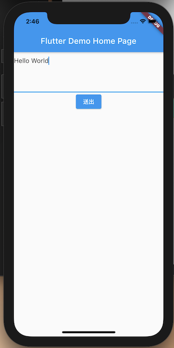
controller:TextField控制元件可以取得相關屬性keyboardType:鍵盤的型態TextInputType.text(文字)、TextInputType.text(數字)maxLines:最大行數onChanged:當輸入有變更時會調用
1 | class DeomBaseTextField extends StatelessWidget { |
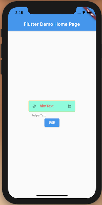
TextField : decoration 客製化風格
contentPadding: 文字間距hintText: 文字輸入框內提示的字hintStyle: 文字輸入框內提示字的風格filled: 是否使用背景顏色fillColor: 背景顏色helperText: 文字輸入框外的提示字prefixIcon: 左邊文字輸入框的圖示suffixIcon: 右邊文字輸入框的圖示enabledBorder: 未點擊時外框顏色focusedBorder: 點即時外框顏色border:外框顏色
1 | InputDecoration( |